Making a Favicon That Actually Looks Right at 16 Pixels
ICO is a container of several sizes, not one image, and that is the whole trick. How to build an icon set from a source image, and why shrinking a detailed logo produces mush.
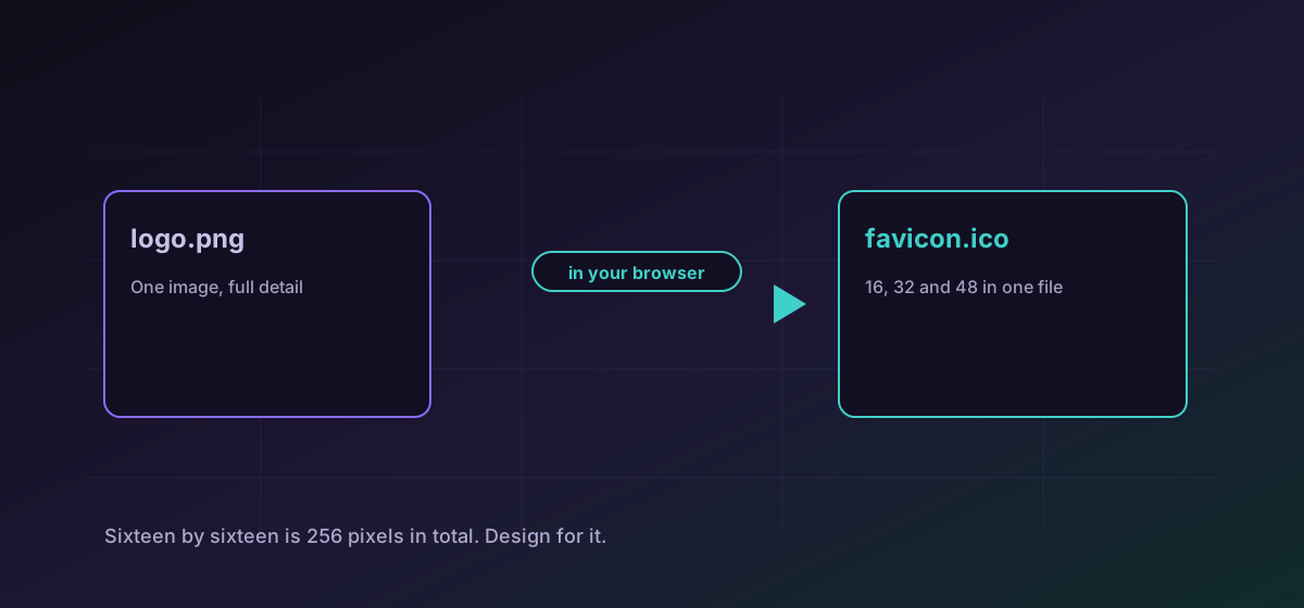
Favicons are a small problem that stays annoying because of one fact people keep meeting late: an ICO file is not an image. It is a container holding several images at different sizes, and the browser picks whichever it needs. That is why a favicon built from a single large PNG can look terrible in a tab and fine everywhere else.
The sizes that matter#
- 16x16 is the browser tab and the bookmark bar. It is the one people actually see, and the one a detailed logo fails at.
- 32x32 covers higher-density tabs and some desktop contexts. The most useful single size if you only ship one.
- 48x48 turns up in Windows shortcuts and a few desktop surfaces.
- 180x180 is the Apple touch icon, and it is a PNG rather than part of the ICO.
Convert PNG to ICO to produce the icon file itself, and keep an SVG as the master so every size can be regenerated from something that never degrades.
Why the small one looks wrong#
The practical answer used by most brands is a separate simplified mark for small sizes. Take the most recognisable element of the logo, drop everything else, thicken what remains, and use that for 16 and 32. It is not a compromise so much as the correct design for the medium.
Transparency and the dark-mode problem#
ICO supports transparency, and you should use it: a favicon with a white background is visible as a white square in a dark browser theme. But transparency alone is not enough. A dark logo on a transparent background disappears against a dark tab strip.
Check your icon against both. If the mark is monochrome and dark, give it a light outline or ship a contrasting shape. This is the single most common favicon defect on otherwise careful sites, and it is invisible to anyone who never switches theme.
A workable sequence#
- Start from a vector master. Every raster size is then generated rather than resampled.
- Make a simplified variant for 16 and 32 before generating anything.
- Export clean PNGs at each size from the vector, rather than scaling one PNG down repeatedly.
- Build the ICO from those PNGs, then look at it in a real tab in both light and dark themes.
If you are starting from a raster logo and want a vector master, tracing a PNG to SVG covers what that can and cannot do. For the general image format trade-offs, see image formats compared.
Troubleshooting
A detailed logo was scaled to 16 pixels. Design a simplified mark for the small sizes rather than resampling the full logo.
A dark mark on a transparent background vanishes against a dark tab strip. Add a light outline or ship a contrasting variant.
Favicons are cached aggressively. Hard-reload, or check in a private window, before concluding the file is wrong.
The source had an opaque white background. Export with real transparency rather than relying on white to read as empty.
Frequently asked questions
Why does an ICO hold several images?
So the browser can pick the right one. An icon designed for 16 pixels and one designed for 48 should not be the same picture, and the container is what allows both to ship together.
Can I just use a PNG as my favicon?
Modern browsers accept one, and an ICO remains the most broadly compatible choice, particularly for older desktop contexts. Shipping both costs almost nothing.
Why does my logo look bad small?
Sixteen by sixteen is 256 pixels in total. Wordmarks, gradients and thin outlines cannot survive that, so most brands ship a simplified mark for the small sizes.
What size do I need for Apple devices?
180 by 180, as a PNG referenced with the apple-touch-icon relation. It is separate from the ICO rather than part of it.
Is my logo uploaded anywhere?
No. The conversion runs in your browser, which matters for an unannounced brand asset in a way it does not for a finished public logo.